top of page


Executions


The Strategy
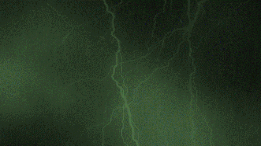
Nightmares don’t happen all at once, they evolve through the night. By dividing the experience into three time-based phases (12:00 AM, 2:00 AM, 3:30 AM). Each label becomes a chapter, and type becomes the emotional driver that signals what stage of the nightmare you’re in.

Objective
To build a beer brand that doesn’t just sit on shelves
- it creeps into memory. Make fear the flavor.


The Challenge
The human problem wasn’t awareness, it was meaning fatigue. Young drinkers are tired of shallow branding. They crave depth, narrative, and a reason to look twice.
The Big Idea
The core insight driving this project is that type carries emotion before it carries meaning. Nightmare reframes the beer label as a storytelling surface, where distorted type reflects the mental state of the night itself, turning typography into the brand’s loudest voice.
Brand
Nightmare Brewing Co. (Fictional)
Role
Concept, brand strategy, typography-led identity, illustration system, packaging
Team
Solo Project
Nightmare (Beer Branding Design)
bottom of page